
RESIDENTIAL CASE STUDY
Romantic And Relaxed French Interior: A Gentle, Healing Colour Experiment
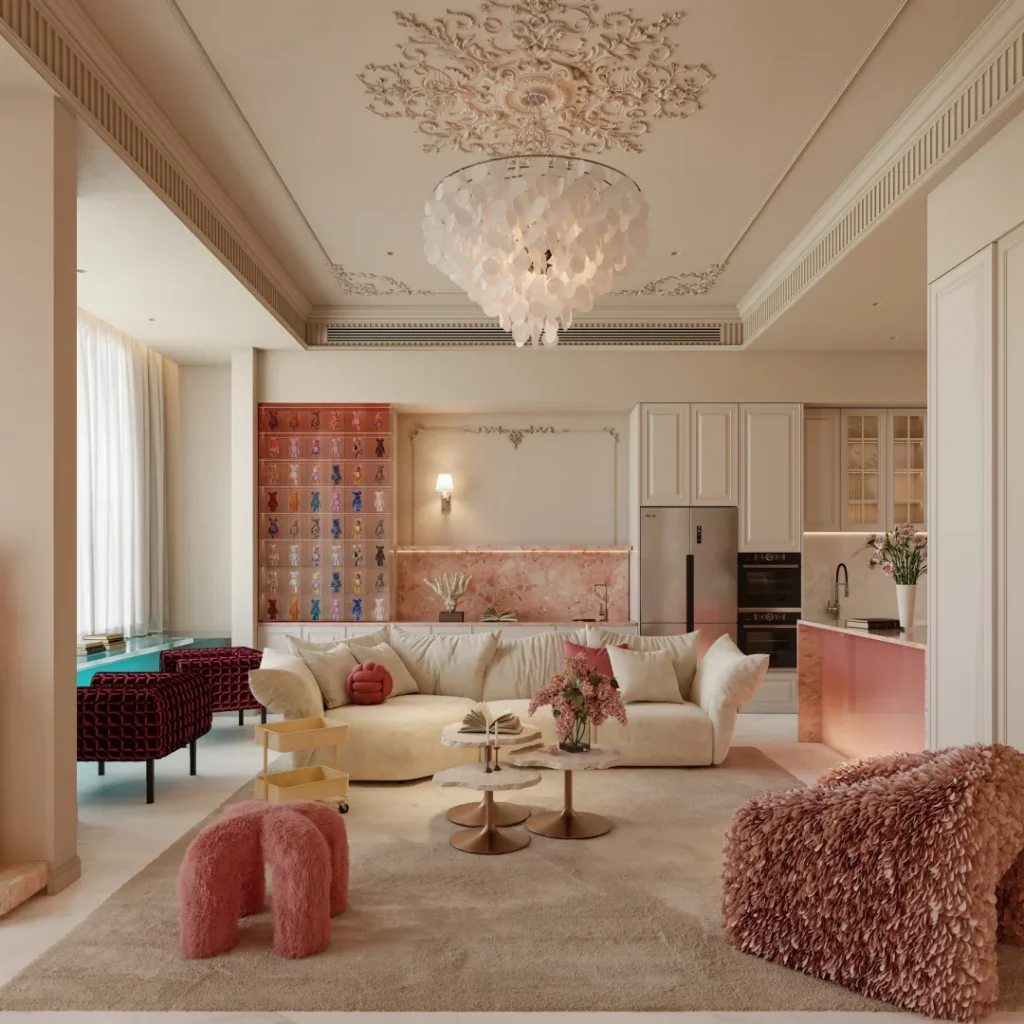
This romantic French interior replaces the usual black-and-white palette with cream, coral, orange-red, aqua green and soft blue accents.
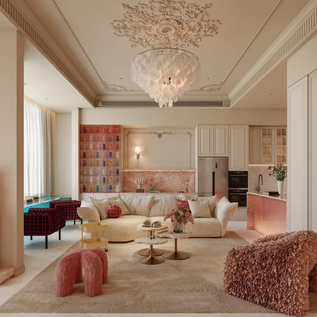
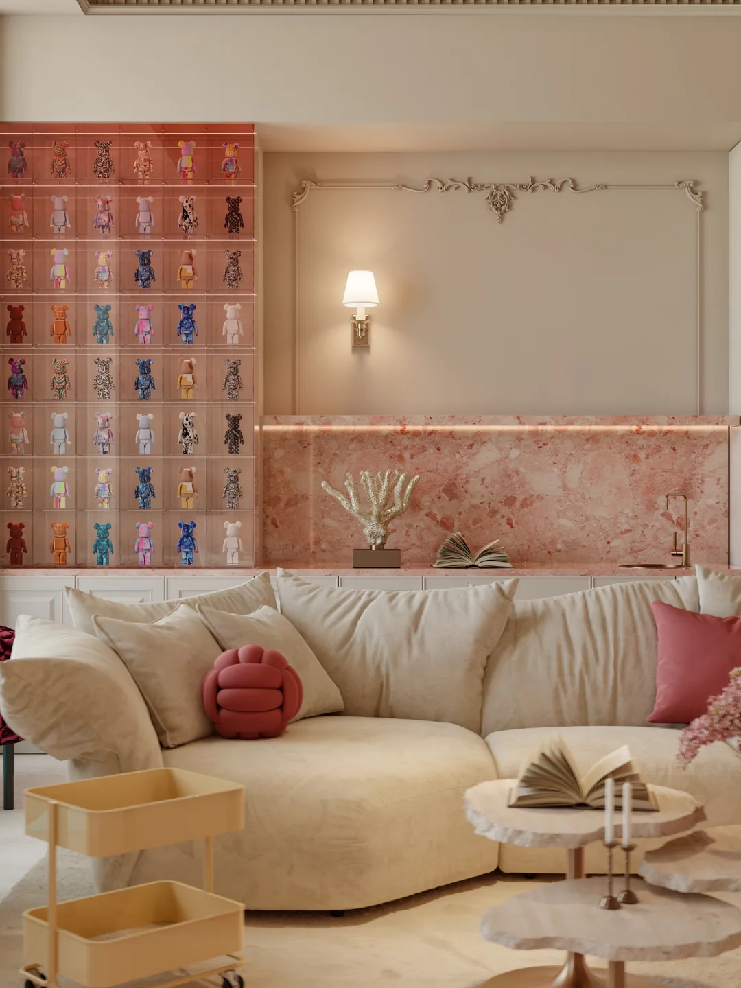
This home does not follow the black, white and dark timber palette commonly seen in French residences. Instead, it chooses a lighter and more emotional colour direction. Cream white becomes the soft background, while coral pink, orange-red, aqua green and small touches of blue appear across furniture and selected wall surfaces, like a painting gently diffused by sunlight.
Romance does not mean fragility. The wall mouldings, fireplace axis and ceiling order remain clear. The difference is that all boundaries are made more approachable through rounded corners, velvety textures and soft light. As a result, the space has both a refined framework and a relaxed sense of living.
Living Room Palette
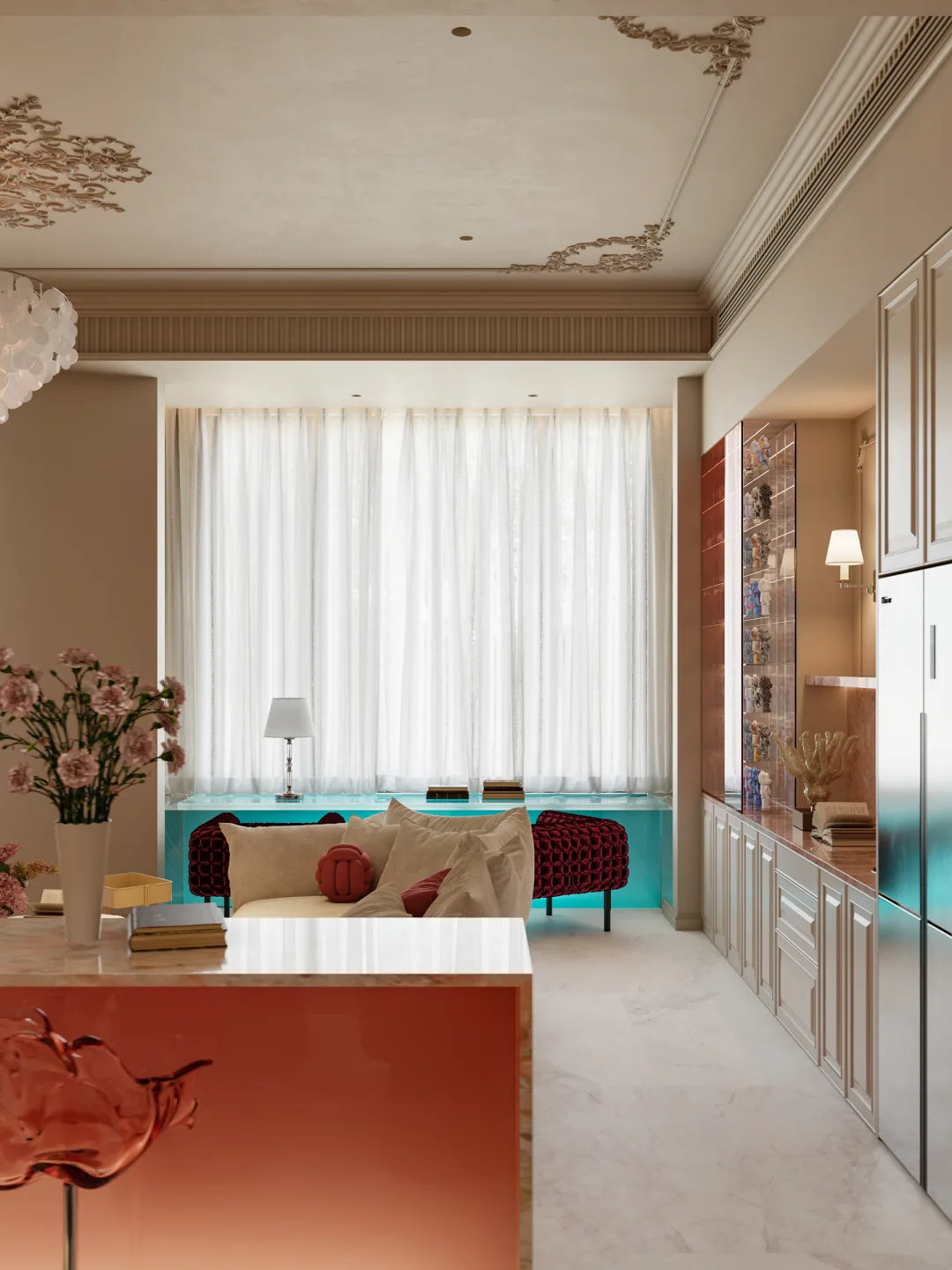
Large areas of cream-white walls and carpet reduce contrast in the space and provide a unified background for colourful furniture. The pink armchair, orange-red volume and green sofa are all noticeable, yet they do not compete with one another.
The colours are kept within a soft, slightly greyed range, avoiding the jumpiness of a child’s room. Ivory furniture and pale timber materials transition between the different colour blocks, keeping the overall atmosphere mature.
Fireplace And TV Wall:
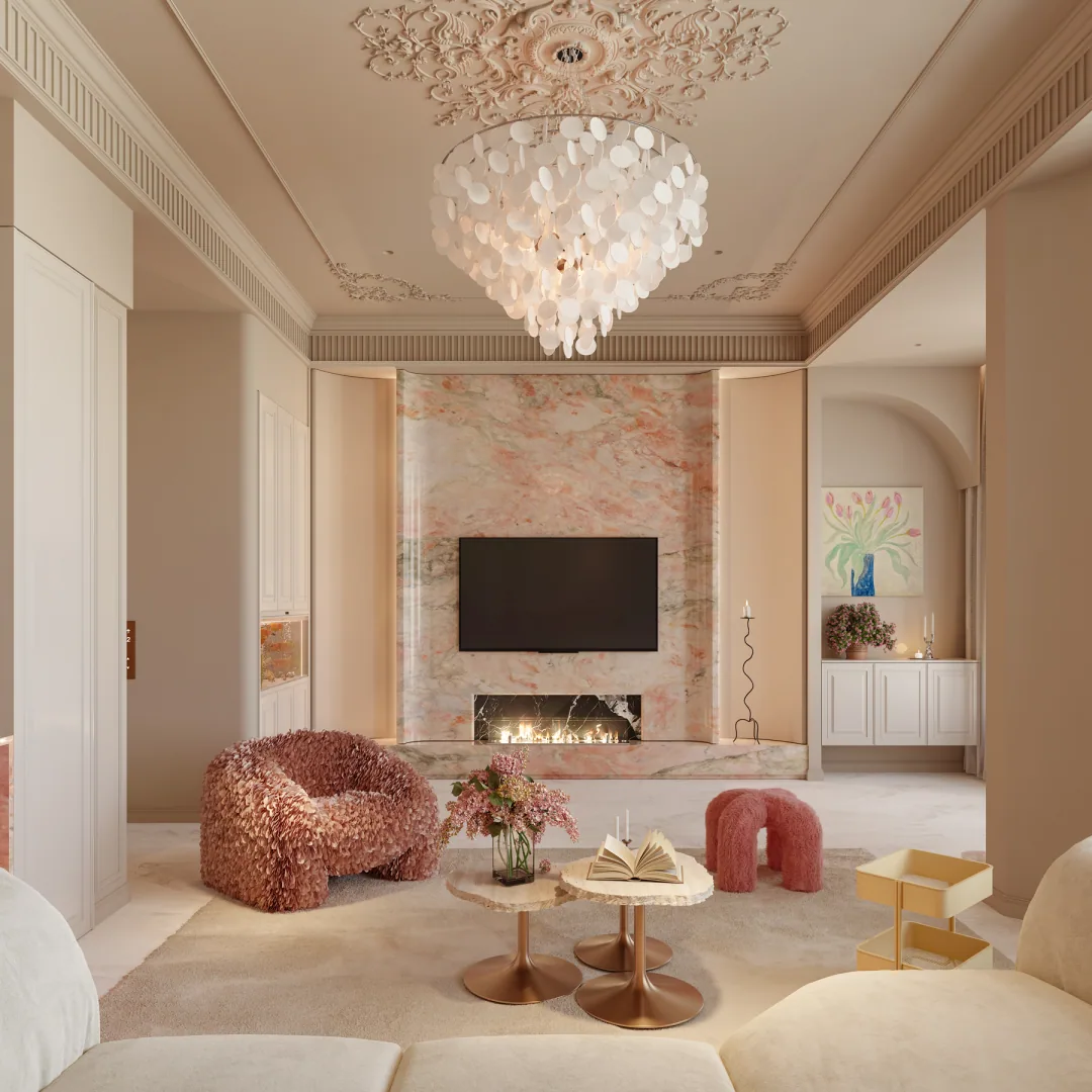
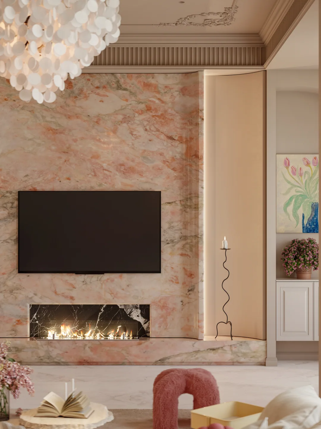
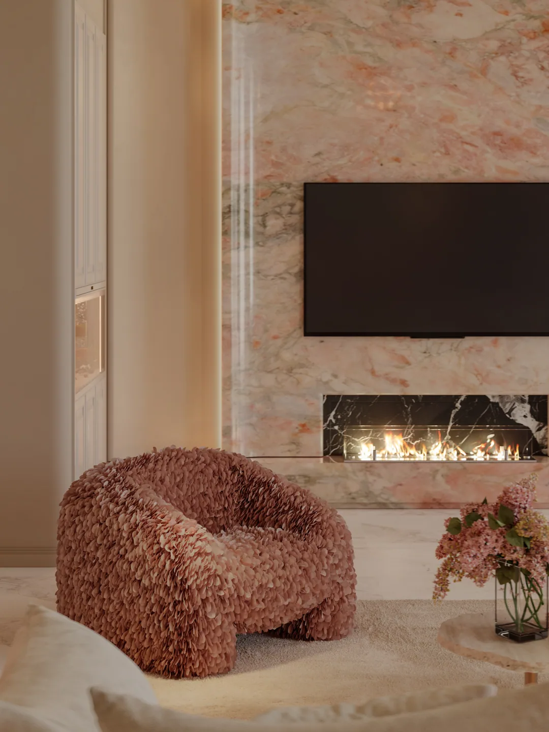
The television and linear fireplace are integrated into a pink-orange textured wall, becoming the main visual focus of the living room. Simple borders are left on both sides, preventing the rich texture from spreading out of control.
The firelight adds warmth to the soft palette and strengthens the evening atmosphere. It is not only decoration, but also the core that organises the sofa arrangement and direction of view.
Furniture Selection
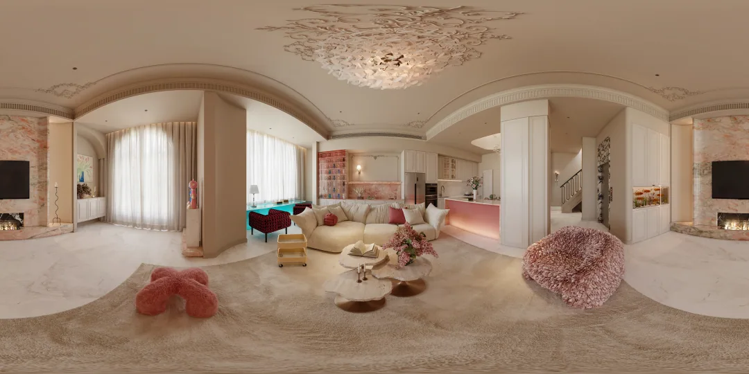
The sofas, armchairs, coffee tables and ottomans generally use low, rounded outlines, reducing sharp edges. Plush fabrics and velvety textures extend the visual softness into real touch.
The furniture is not arranged with strict symmetry. Instead, it sits like a group of naturally placed islands around the central zone. This informal layout is better suited to conversation, reading and easy movement, and makes the French interior feel less restrained.
Multi-Functional Area
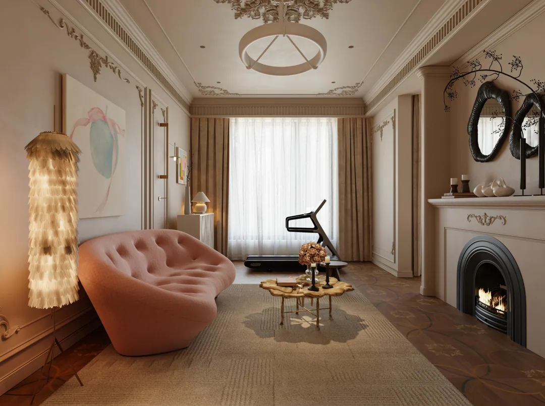
Exercise equipment is incorporated into a space with a fireplace and art decoration, allowing function and atmosphere to exist together. The treadmill is no longer isolated in a cold, hard room. It appears alongside soft colour, artwork and refined lighting.
This approach shows that residential aesthetics do not need to exist only in the living room. As long as materials, lighting and colour logic remain unified, even highly functional areas can become comfortable scenes.
Lighting Design
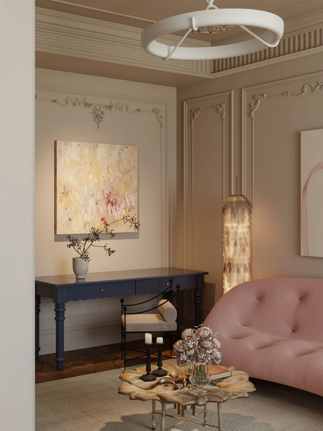
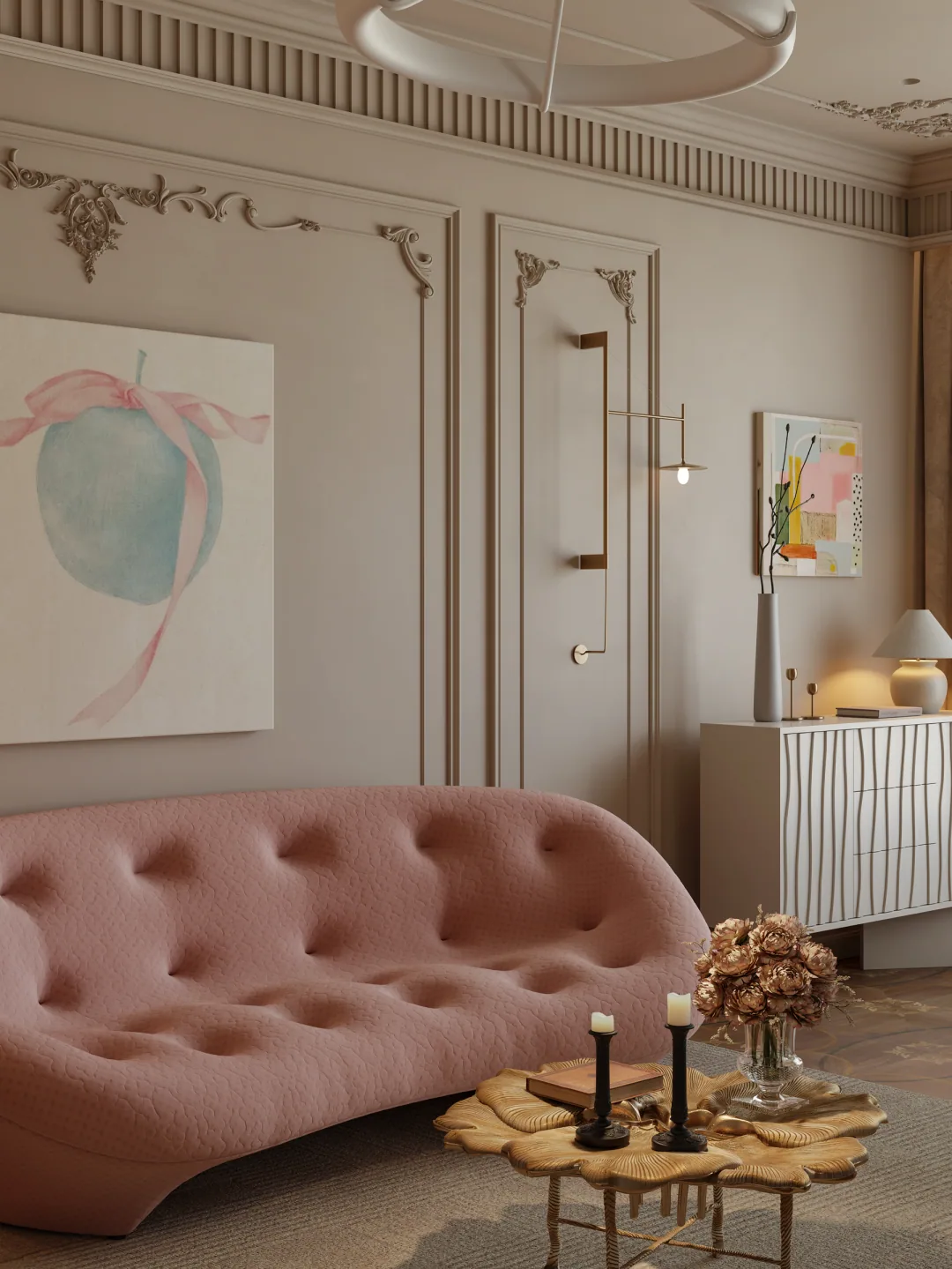
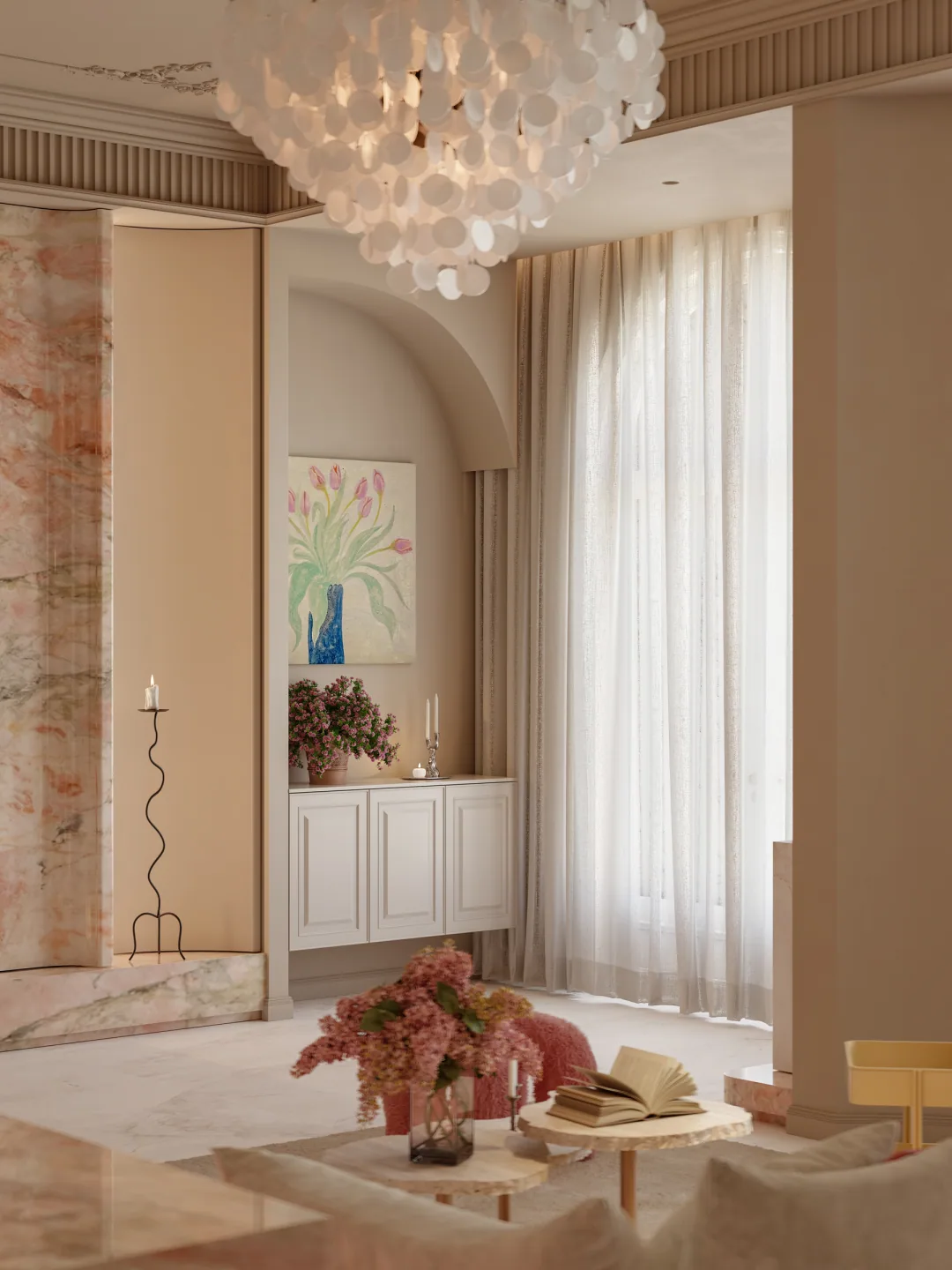
The crystal chandelier provides the glamour associated with French style, while recessed lighting, wall lights and firelight create soft layers. The brightness and height of different light sources are staggered, giving the space different expressions by day and night.
Warm light makes the pinks, beiges and timber tones feel fuller, and prevents the pale interior from looking washed out. In this case, atmospheric lighting is far more valuable than simply chasing brightness.
Design Summary
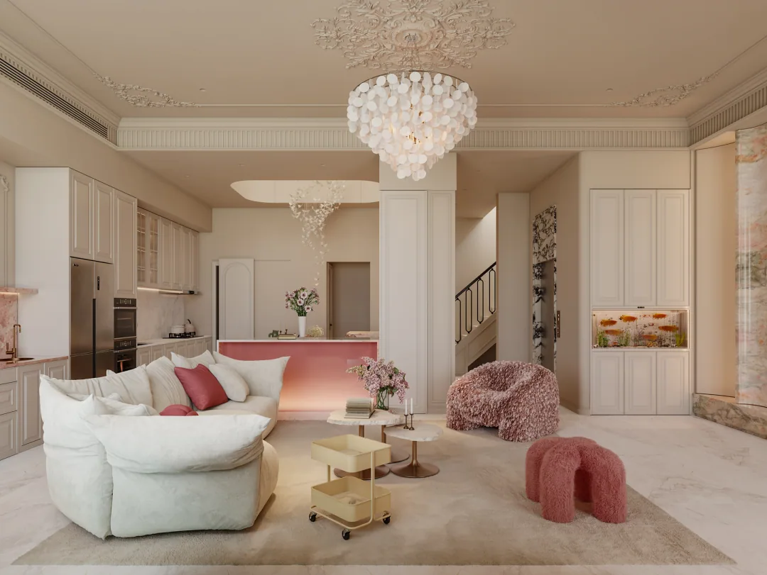
This project proves that a healing interior does not have to rely only on ivory and raw timber. As long as relationships are controlled through consistent brightness, soft materials and a clear framework, multiple colours can still feel calm and enduring.
To borrow from this romantic French approach, begin with one neutral base colour, then add two or three low-saturation colours, concentrated in replaceable furniture and soft furnishings. This preserves emotion while leaving room for future adjustment