
French Elegance Private Residence: Klein Blue in a Black and White Interior
The most compelling quality of this French-inspired home is the way elegance and strength coexist. White wall panelling, fine mouldings and a crystal chandelier preserve a classical character, while black door frames, bookcases and geometric flooring establish a clear, assertive structure.
The richly saturated blue sofa becomes the strongest visual focus in the home, creating a cross-room dialogue with the orange-red dining chairs. Colour is not spread evenly throughout the space. Instead, it is concentrated in a few key furniture pieces, making the overall design both bold and restrained.
1. Entry And Hallway
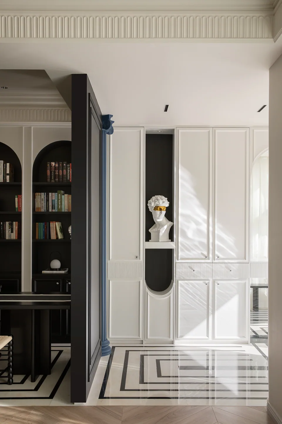
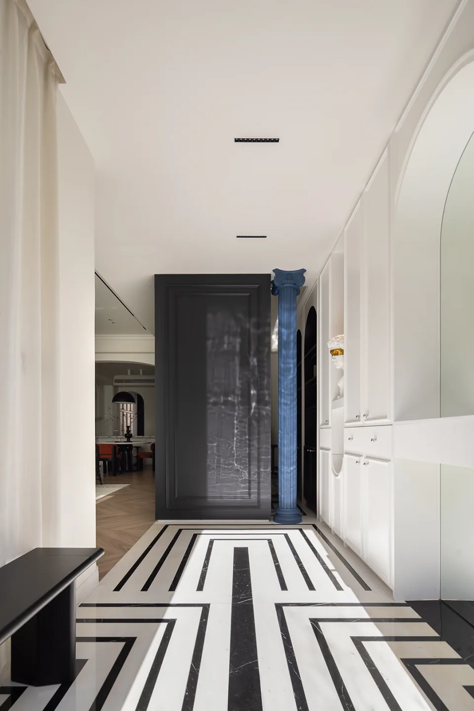
The black and white geometric floor extends from the entrance into the transitional areas, using a strong sense of direction to draw the eye towards the shared living spaces. White wall panelling on both sides contrasts sharply with black doors, giving the home a defined character before one even reaches the living room.
Sculpture and localised lighting within the wall niches provide moments of pause, preventing the long hallway from feeling monotonous. Decoration is embedded into the architectural surface rather than scattered through the circulation path as loose objects.
Living Room
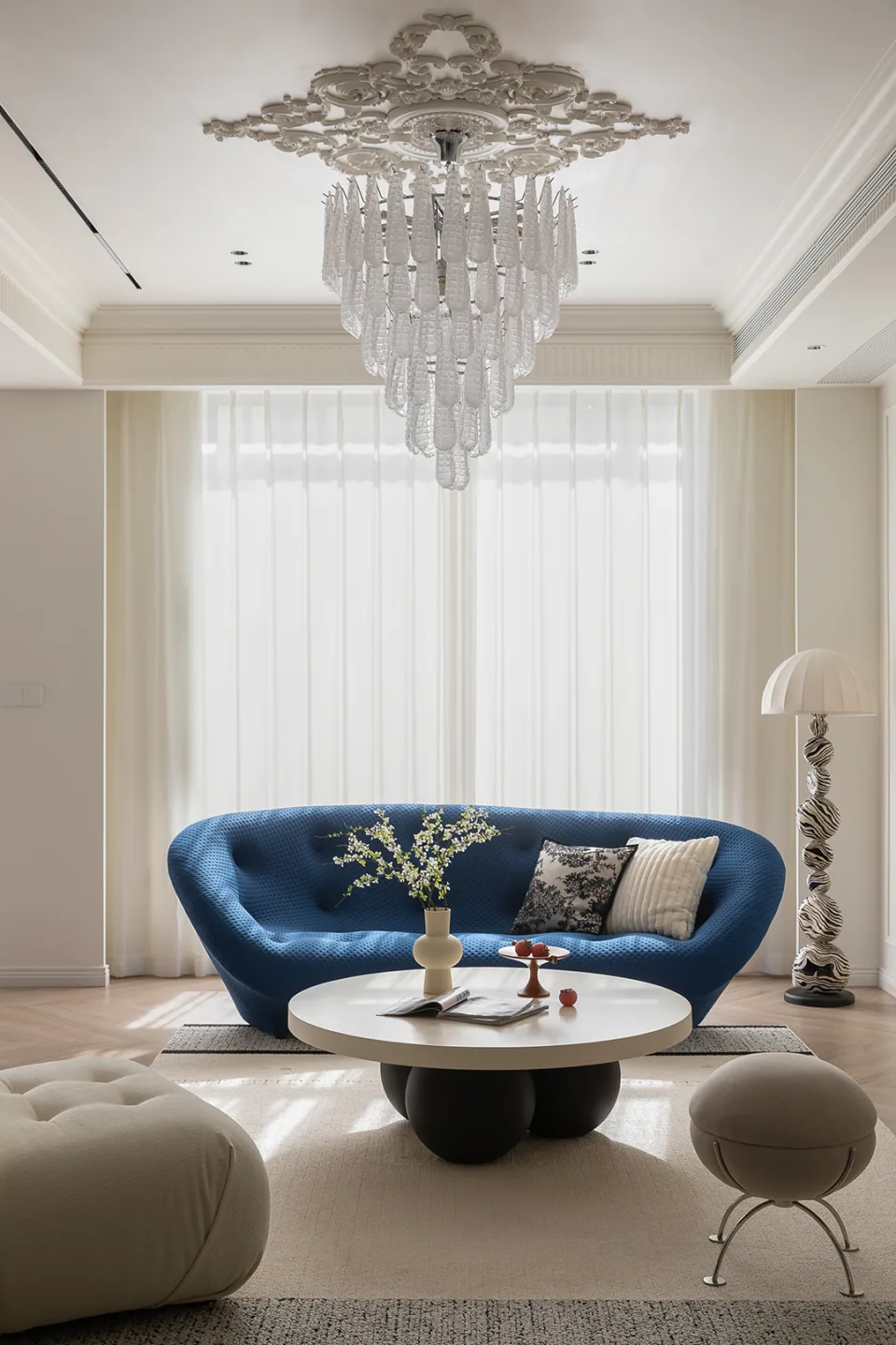
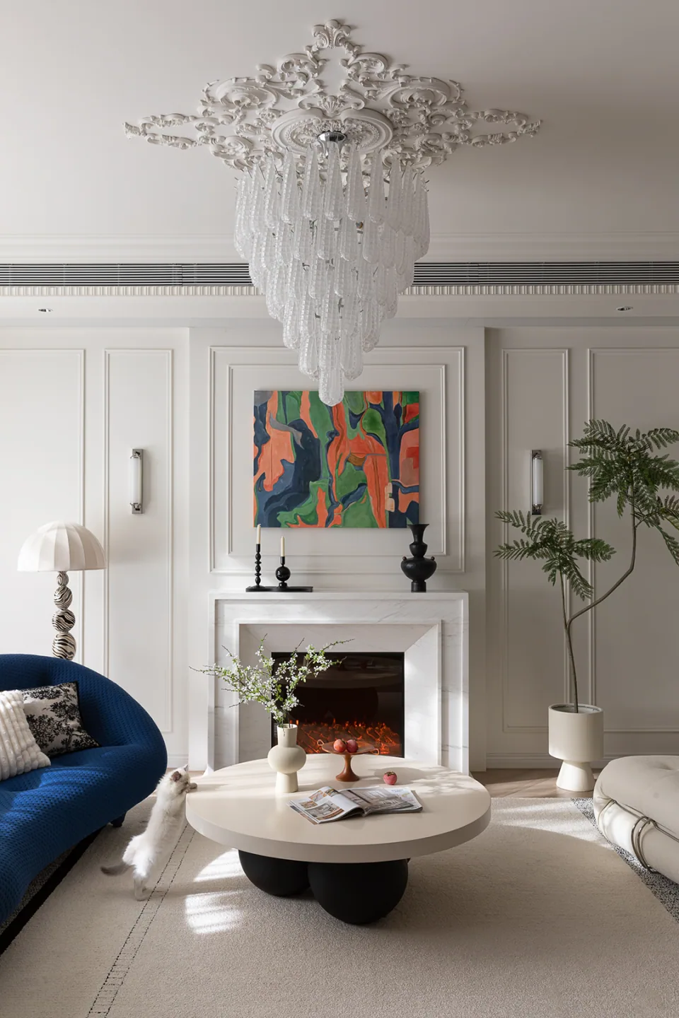
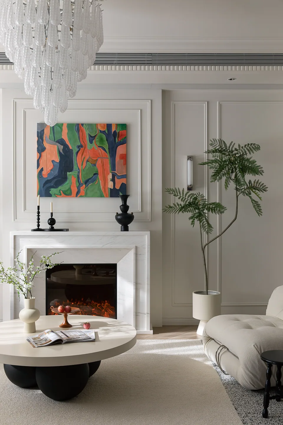
The curved blue sofa uses saturated colour and a rounded silhouette to break away from the formality often associated with traditional French interiors. White armchairs, round coffee tables and a calm fireplace backdrop give the blue enough room to take centre stage.
The crystal chandelier unfolds vertically, forming a stable central axis with the fireplace and artwork. Classical composition is reinterpreted through modern furniture, so the space does not stop at vintage imitation. Instead, it feels fresh and contemporary.
3. Study: Black Arched Joinery Creates A Calm Reading Setting
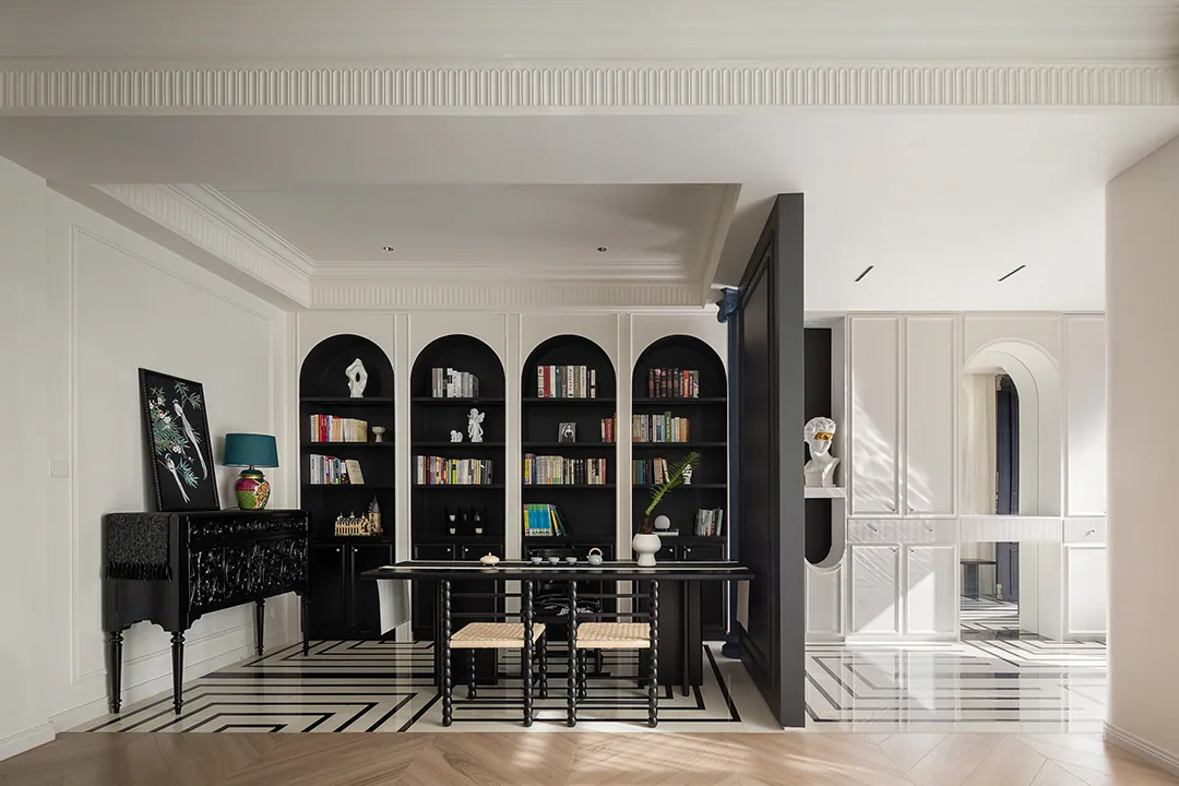
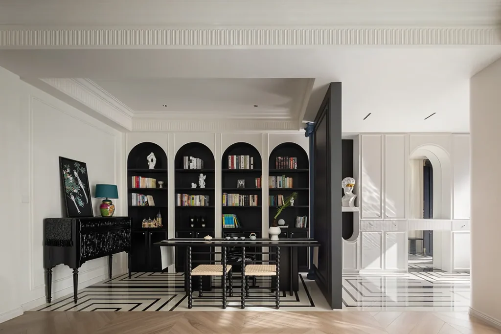
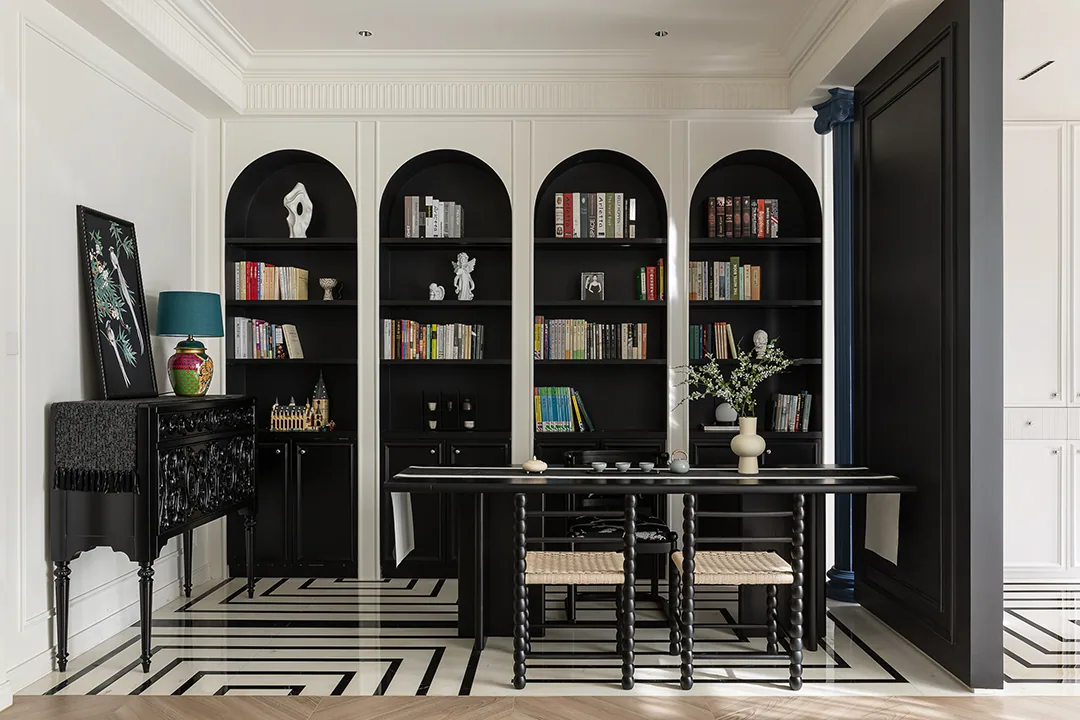
The full wall of black arched joinery functions as both storage and spatial structure. Repeated arches create rhythm, while books and objects add layers of richness against the dark background.
The desk and metal balustrade remain visually light, preventing the black volume from feeling too heavy. The living room and study maintain visual connection, while changes in material and flooring create clear zoning.
Dining And Kitchen
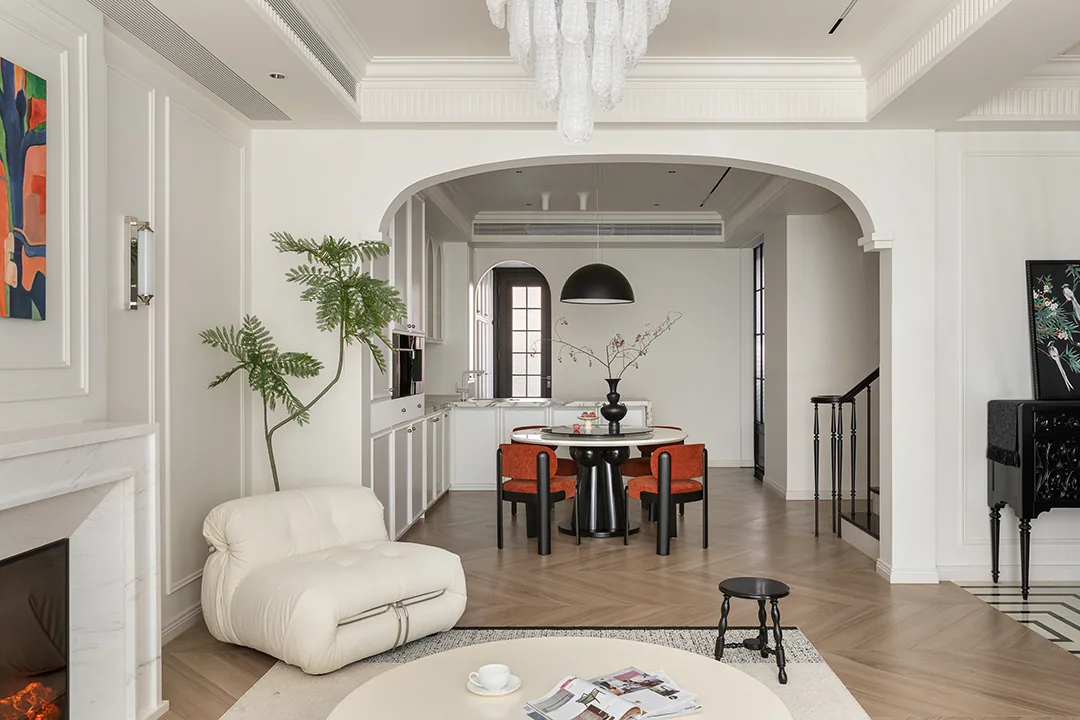
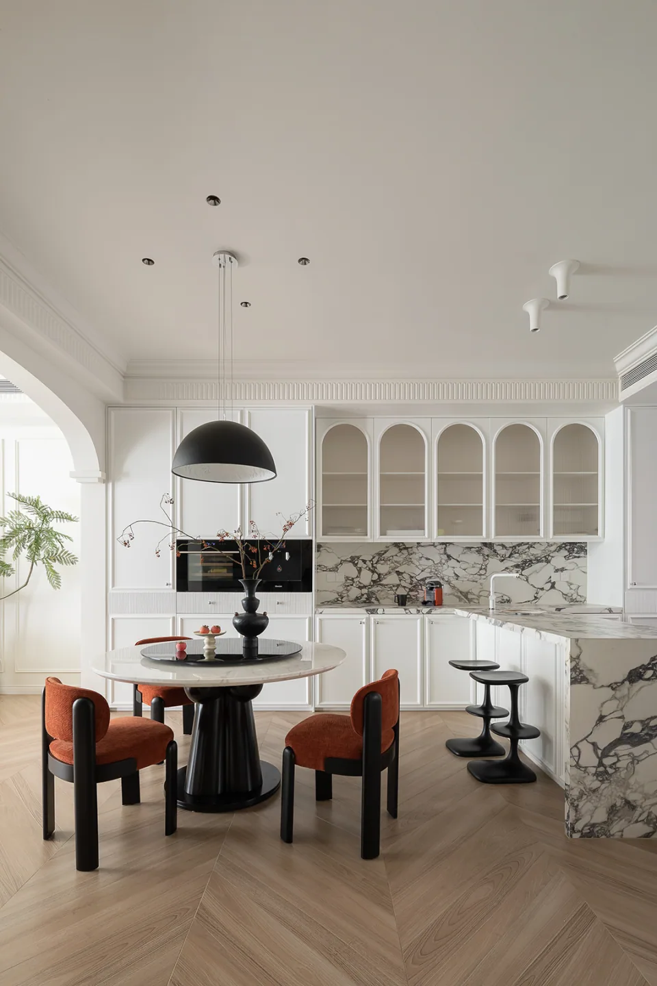
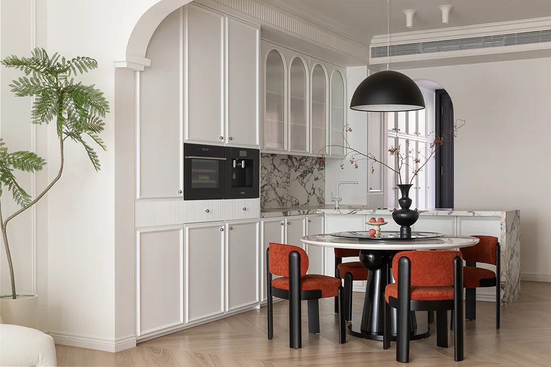
The dining area combines a black round table with orange-red dining chairs, creating a vivid pairing. A pendant lowers the visual centre of gravity, making the dining scene feel more gathered and intimate. The arched glass cabinet continues the home’s formal language and provides an elegant backdrop for displaying tableware.
The kitchen uses white doors and veined stone to keep the space bright. The natural movement of the marble island benchtop balances with the black lighting, giving this functional area an artistic quality as well.
Staircase And Vertical Flow
The black metal staircase echoes the door frames and bookcases with crisp linearity. The open space beneath the treads keeps vertical circulation from feeling heavy. Wall mouldings continue into the staircase area, ensuring the design language remains consistent across different levels.
In a duplex residence, the staircase can easily become the most disconnected element. In this case, the consistent black and white palette makes it part of the home’s overall composition.
Design Summary
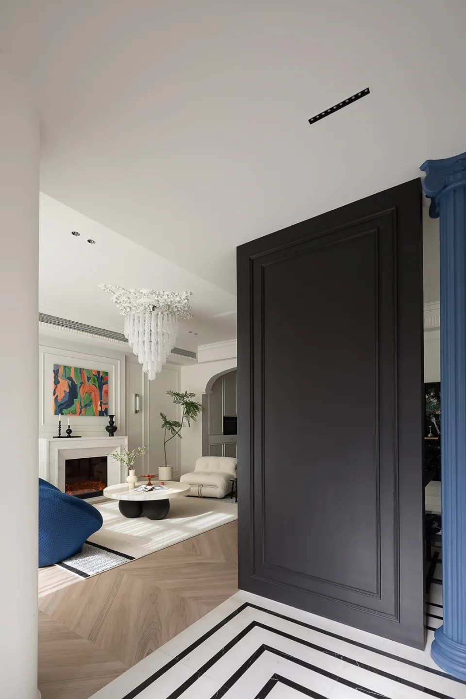
When a refined French framework is combined with black structure and highly saturated furniture, the result is a more powerful form of elegance. What truly matters is proportion: large areas of white create breathing space, black defines the form, and blue and orange-red speak only at key moments.
To borrow from this approach, begin by choosing one main colour focus, then use black and white to build a stable background. The stronger the colour, the more restrained the quantity should be. That is what allows each visual protagonist to be properly seen.